ARTUNIS
SITE DESIGN + BUILD
CONTEXT / OUTCOME
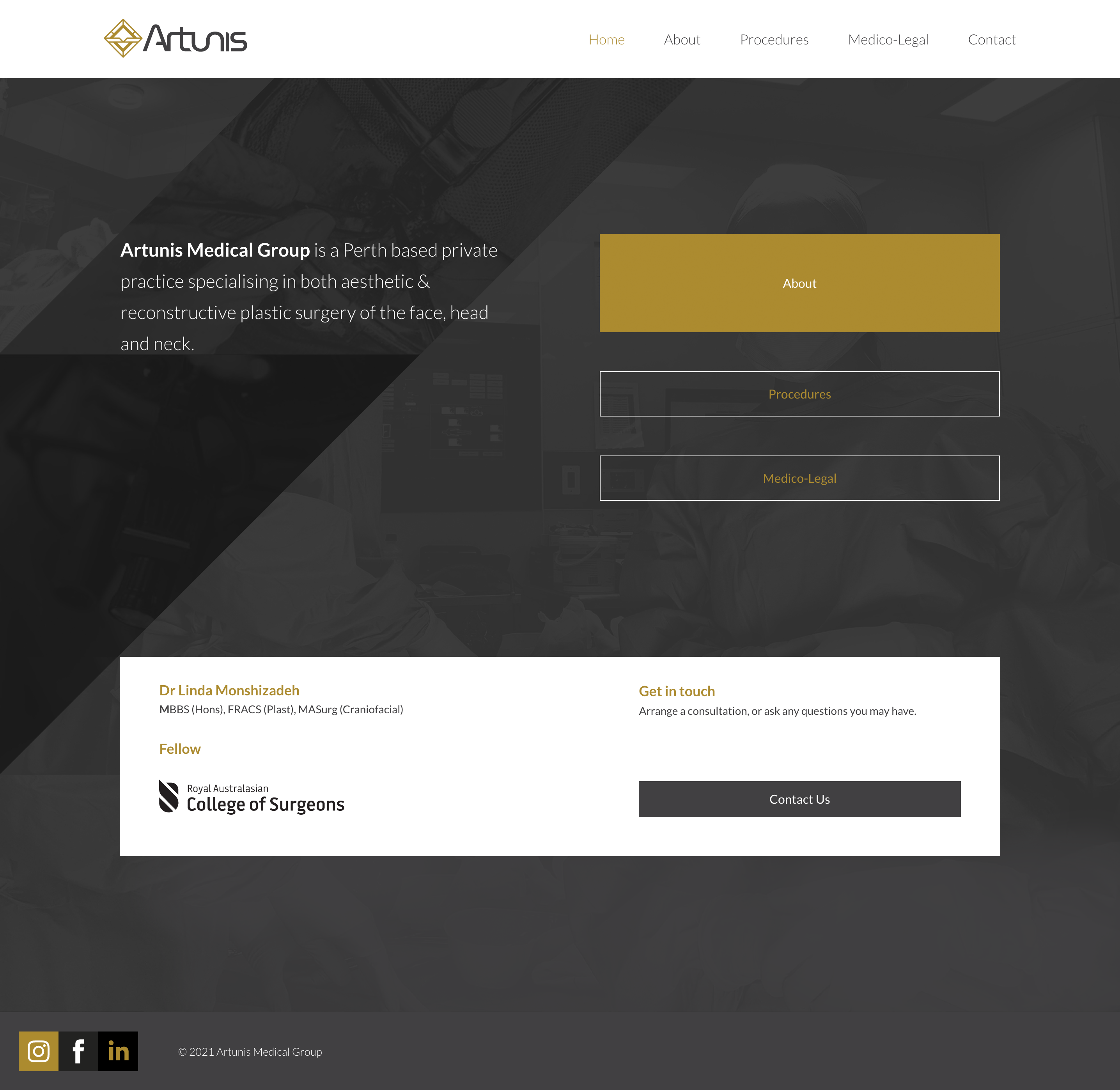
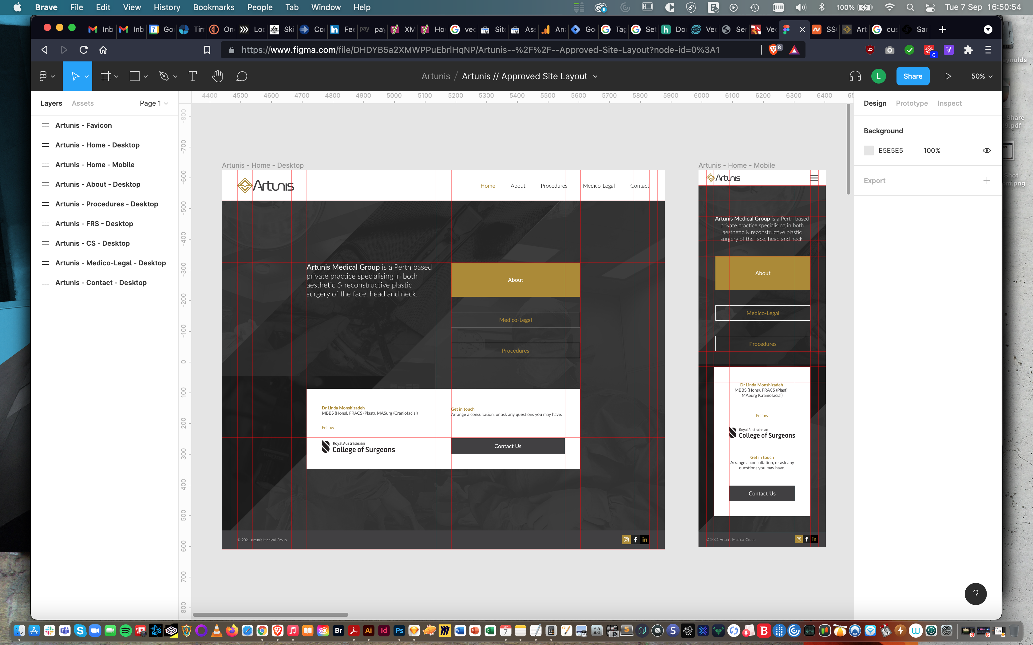
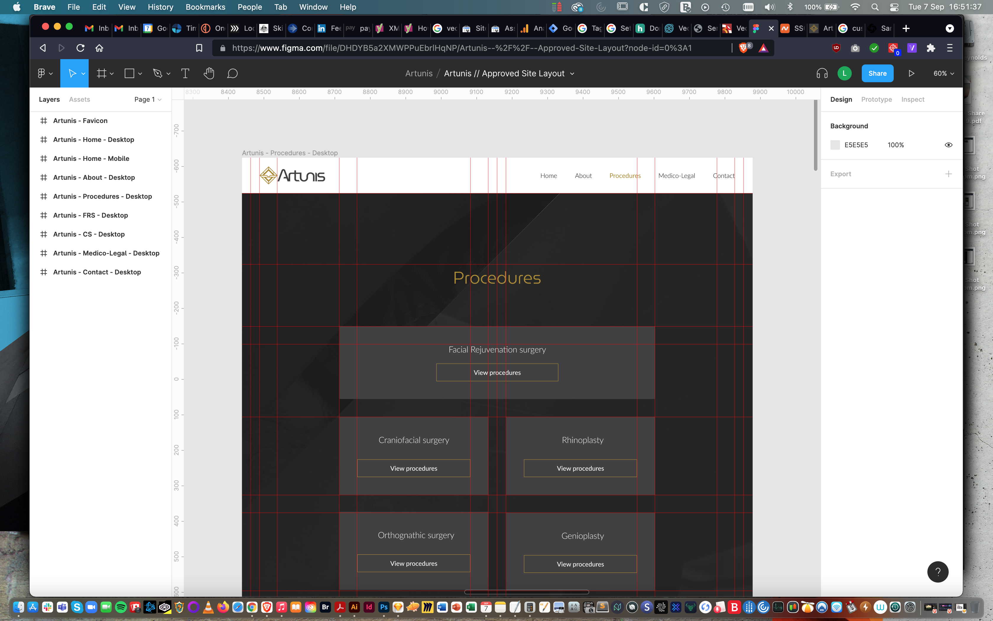
Having already completed the logo design, brand guidelines and corporate identity for Artunis, the next objective was to design, build and launch the website.
Dr Monshizadeh had already secured her domain and wanted to use that same provider for hosting. We swiftly agreed upon which platform to build and from there I began executing layout design in Figma.
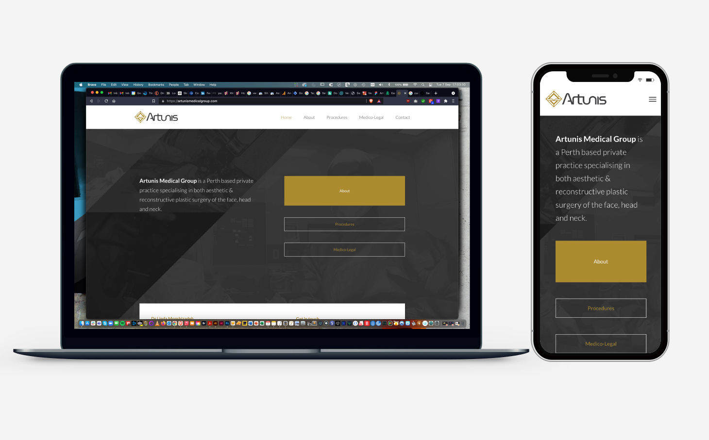
After a couple of brief rounds of feedback, the layout was approved. I rapidly moved from build through testing to launch and post-launch optimisation. The result is a bold, simple, modern, functional experience which will serve Artunis well for years to come.
TOOLS
SWATCHES
#AD8A19
#FFFFFF
#404041
ARTUNIS
BRAND IDENTITY
CONTEXT
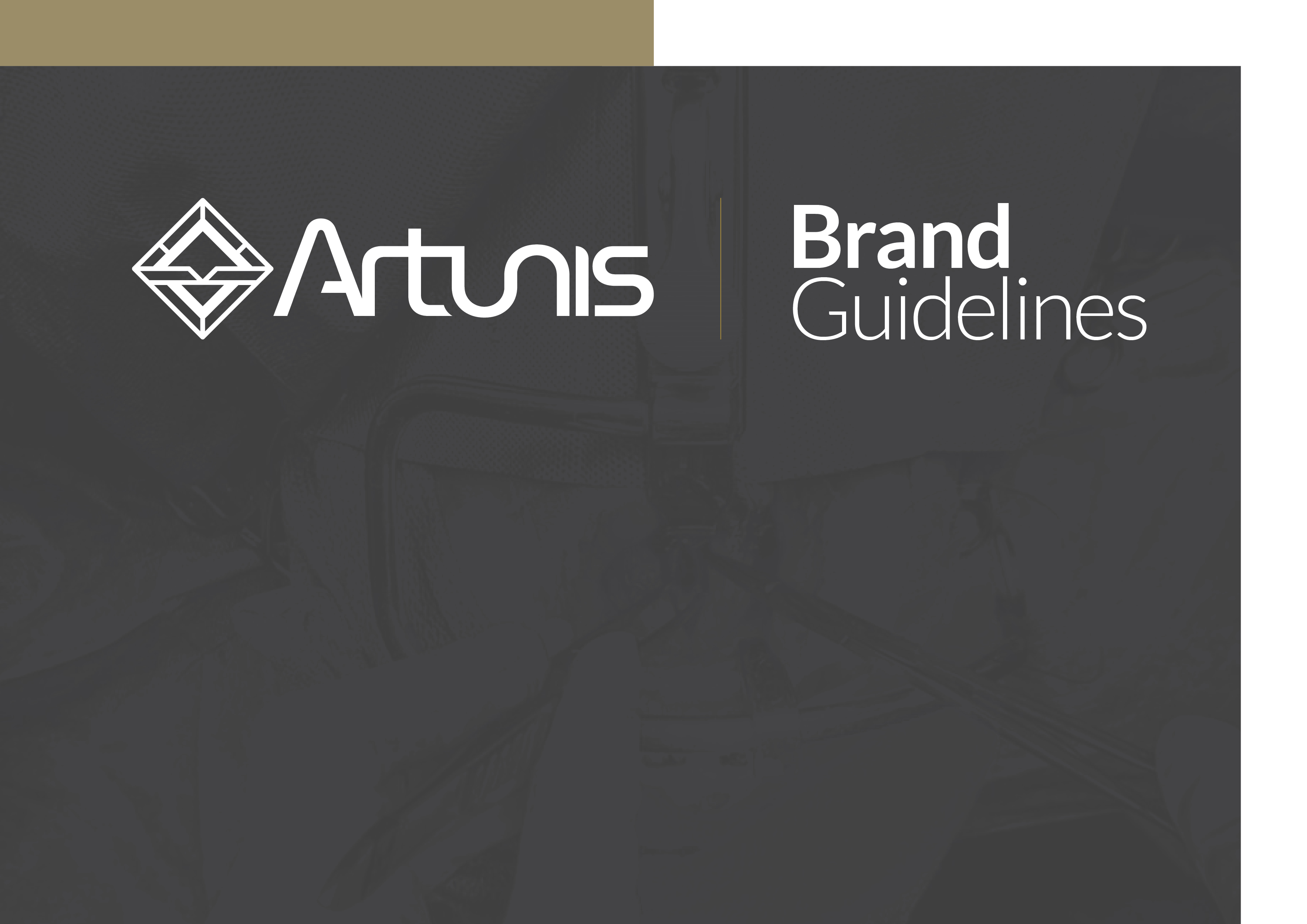
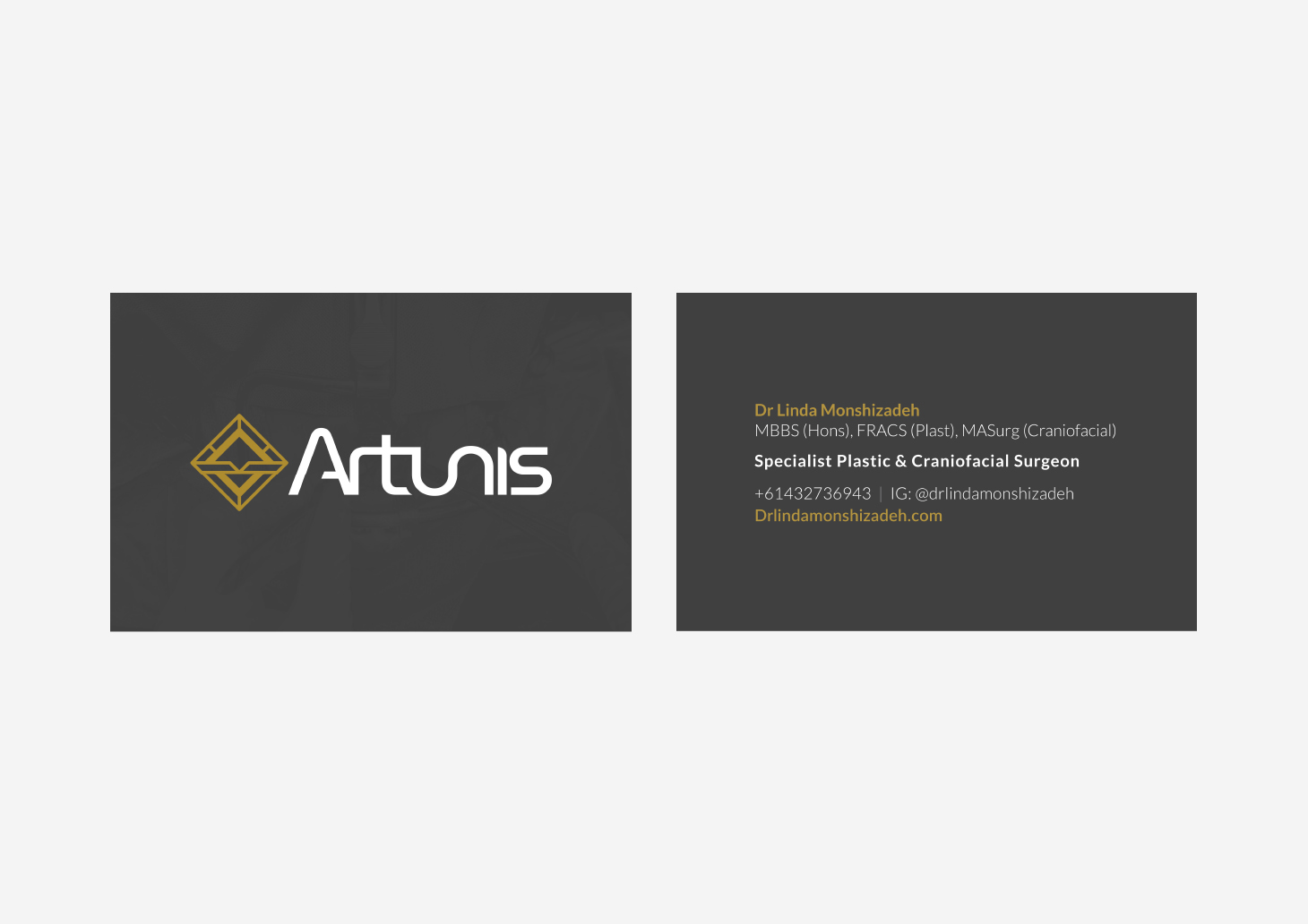
When the time came to design Artunis Medical Group's brand, Dr Linda Monshizadeh elected to come directly to someone she knew she could trust.
Dr Monshizadeh wanted to draw from her heritage in choosing the name for her holding company. Lieutenant Commander Artunis (540-500 BCE) was the daughter of Persian Lieutenant General Artebaz, during the reign of Darius the Great. She is renowned for being a brave and powerful woman, whose name means 'true and faithful'.
Dr Monshizadeh prizes artistry and creativity, and so wanted something that was bold, simple and creative for her brand. She knew she wanted a fairly simple colour palette incorporating metallics and shades of grey, and was highly open to the idea of an abstract approach in terms of iconography.
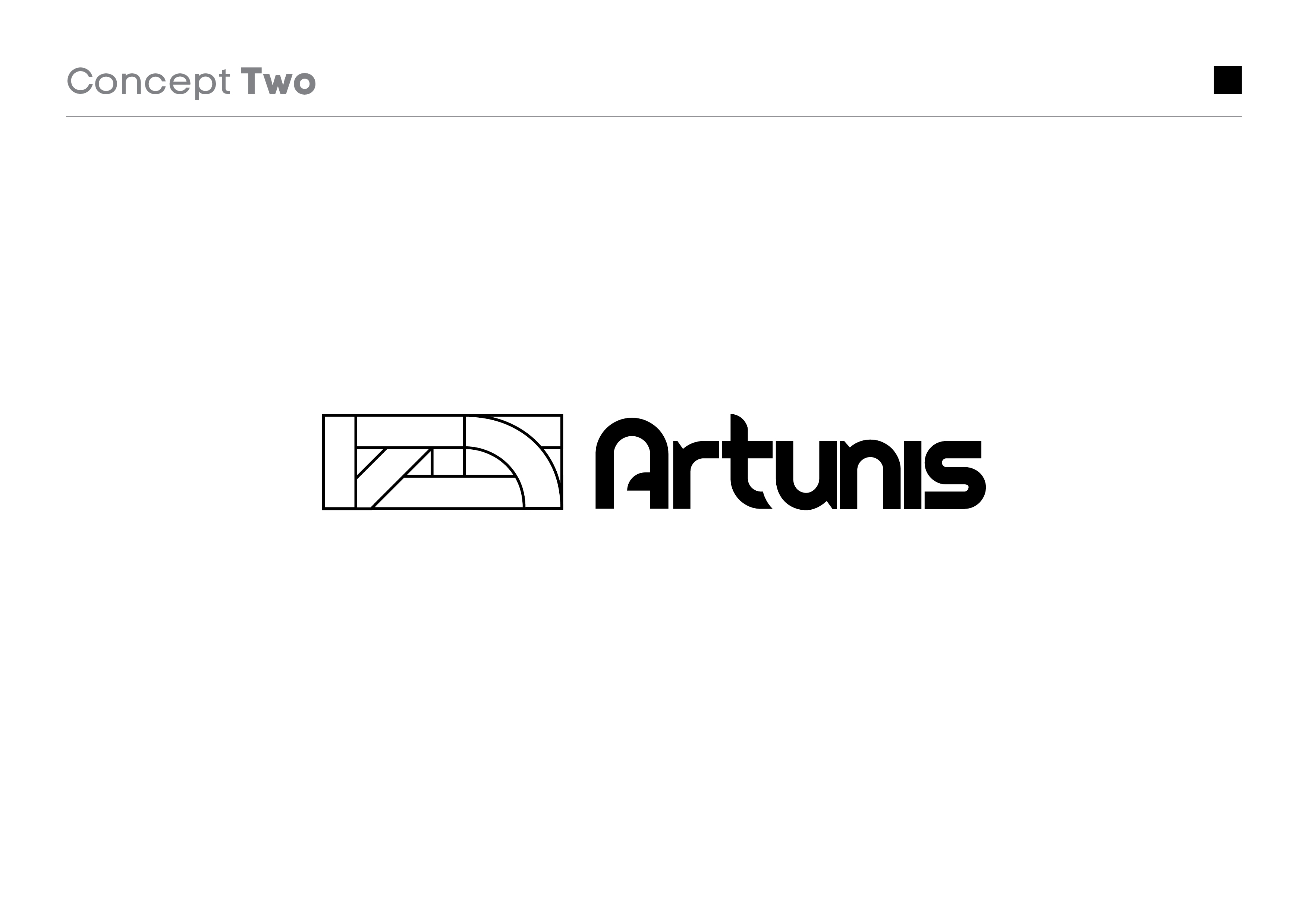
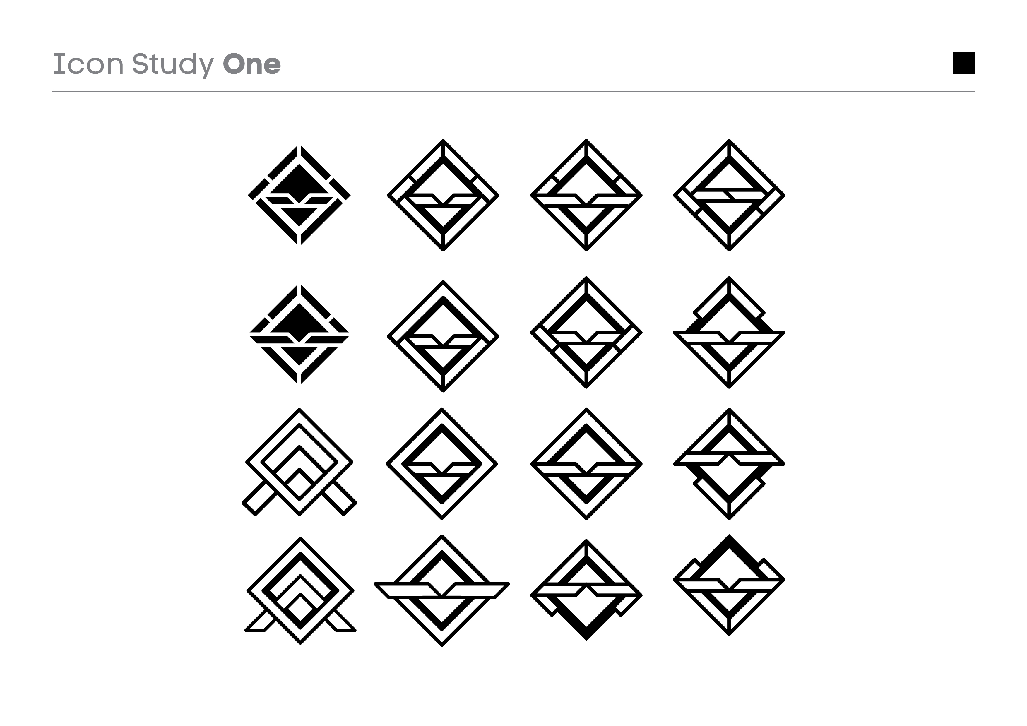
Following my protocol of only executing initial brand conceptual work in black and white, I began exploring a combination of stylised word mark craft and abstract iconography to see if I could come up with something that captured the essence of what was being sought. In the very first round Dr Monshizadeh picked a word mark from one concept and icon from another that she loved and believed to encapsulate the vision she had.
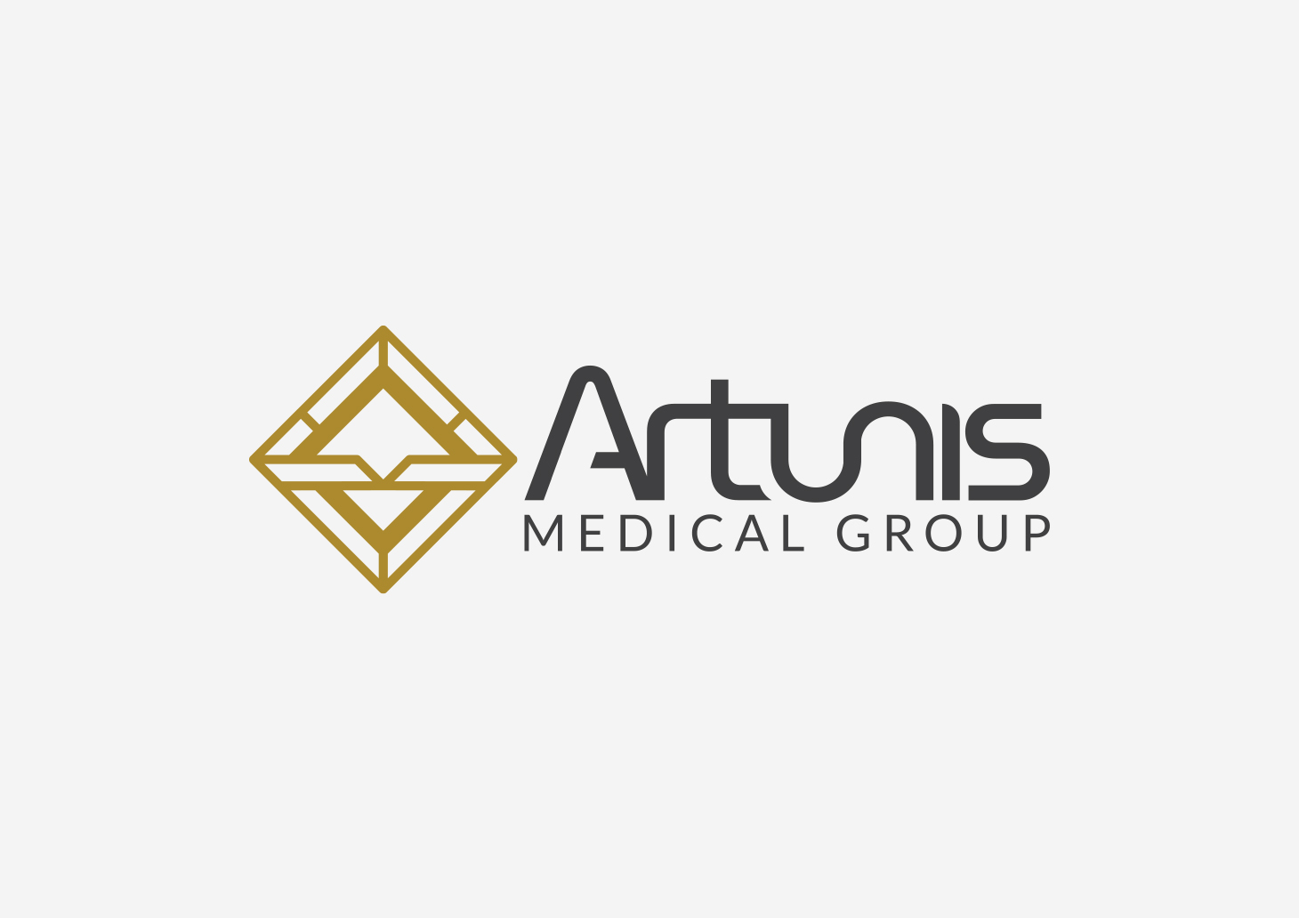
From there we proceeded through two short development rounds to refine composition before beginning colour exploration and settling on a final form, along with several variations to provide the brand flexibility.
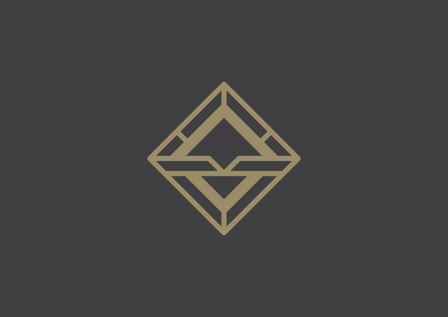
The chosen icon was designed to be emblematic of bucklers, or shields commonly used by soldiers in the ancient world, whilst also nodding to ideas like layering and reconstruction. In both icon and word mark I looked to nod also to both precise incisions and assembly. I aimed to create something that was simple and bold, whilst also conveying intricacy and complexity.
TOOLS
SWATCHES
#AD8A19
#FFFFFF
#404041
MORE WORK
MORE WORK
MORE WORK
MORE WORK
MORE WORK
